Sunday, December 9, 2018

art

My sketch
Portrait of myself

Christina Queen of Sweden 1644-1654 by David Beck 1650
 Christina 1626-1689 Daughter of King Gustaves
Miniature portrait of Charles X King of Sweden 1655-1660 by Alexander Cooper 

Girl with pearl earrings by Verneer 36 painting in 18 Museums in 7 Countries 

1. I selected these pieces because they was unique. The color of her hair stood out to me in the Girl with the pearl earrings. I liked the size of the Miniature portrait of Charles X King of Sweden. I just was a little intrigued by the facial expression of Christina Queen of Sweden.
2. I choose pencil and coloring pencils because I'm a beginner to the art field.
.3. The hardest part for me was making a nose and trying to find a shade for my skin tone.
4. This piece means to me that I did a lot better than I thought I would.
5. I applied lines, shapes, value and pattern.
6.yes I enjoyed having a little free time to sketch and capture the essence of Me!!
7. I'm satisfied with my work it turns out a lot better than what I expected
Art Curation.


I enjoyed doing this project. I had a chance to you select art that spoke to me.  I was able to be  moved or inspired by the art work, sculptors, statues and currency . I picked peace cause this is something that I'm struggling to find myself. I wanted to look at the different aspects and messages conveyed when these artist choose these pieces that inspired them by the word peace. I also found what is peace for one person is not peace to another. I'm still learning about Art but its a great hands- on way to become more knowledge-able about different cultures and styles. I had a chance to critic the art and look at how the artist used certain elements of art to create their art. I chose things that reminded me of some form of  peace. The  Ancient Peace Drawing gives me the feeling like im meditating. I feel that it helped me concentrate on one thing and not let my thoughts  wonder. the landmark at MLK park also inspired me. It showed me that how coming together can bring peace to individuals who struggle daily due to unfair living conditions and circumstances . I also liked the piece by Youri Chasov the peace abstract. I picked that picture because I feel like the pattern of colors represents the body when you are at a happy place and feel like the colors are moving with you. I picked believe as my title because we don't have peace because we don't believe it's obtainable, but it can be without us even knowing. I picked these pieces because the artist believed in their work and the process that needs to be followed to obtain the final draft.  


Thursday, December 6, 2018

reflections


Week 16 reflections

1.    I read my very first post on Blogger

2.    I just thought it was going to teach me about paintings, but it taught me about the evolution of Art and the different ways artist express their- self. My expectations were to low and I learned so much from this class, Art is a form of expression. It can be defined as visual, audio, music, literature and dance. Artist using these techniques to convey a message. The message can be formal or informal. Art is a way to express your feeling and skills. It can tell a story. So much goes into art and what is Art?

3.     I don’t have a favorite Artist yet, but I do enjoy learning about the different styles of painting. I like learning the history behind sculptors and the steps it takes to complete a master piece.

4.    This is my first on-lone course and I think I did great. I’m learning that different Teacher’s post assignments and content in different places. I know now that I must look in different places for assignments, study guides and rubrics. I signed up for another on-lone course next semester. My answer is a little different, because I have a lot my knowledge about art, but my attitude is the same. I have to try my best and give it all I got.

Monday, December 3, 2018

Exhibit: Theme :Peace Title: Believe


I enjoyed doing this project. I had a chance to you select art that spoke to me.  I was able to be  moved or inspired by the art work, sculptors, statues and currency . I picked peace cause this is something that I'm struggling to find myself. I wanted to look at the different aspects and messages conveyed when these artist choose these pieces that inspired them by the word peace. I also found what is peace for one person is not peace to another. I'm still learning about Art but its a great hands- on way to become more knowledge-able about different cultures and styles. I had a chance to critic the art and look at how the artist used certain elements of art to create their art. I chose things that reminded me of some form of  peace. The  Ancient Peace Drawing gives me the feeling like im meditating. I feel that it helped me concentrate on one thing and not let my thoughts  wonder. the landmark at MLK park also inspired me. It showed me that how coming together can bring peace to individuals who struggle daily due to unfair living conditions and circumstances . I also liked the piece by Youri Chasov the peace abstract. I picked that picture because I feel like the pattern of colors represents the body when you are at a happy place and feel like the colors are moving with you. I picked believe as my title because we don't have peace because we don't believe it's obtainable, but it can be without us even knowing. I picked these pieces because the artist believed in their work and the process that needs to be followed to obtain the final draft.  

Sunday, November 11, 2018

art experience

I enjoyed going to the art gallery and looking at the different exhibits . It was fun to see how the different artist used different techniques to express their self .


Art gallery visit #2

(step #1)The exhibition that I seen was called We the people New Art from the collection
The theme was looking at each individual artist and the things and environment that shapes them. A lot of the objects used was from the artist neighborhood that was collected and used in an different content in which it was made.
(step #2) The type of lighting that was used was a soft low light. The walls was all white and the space was bare feeling. It was many rooms housed inside little rooms. The movement of the viewers was the same as mine many had notebooks and phones out taking pictures and learning different information about the art work
The art was organized on the walls neatly, it was sculptures in the middle of a few of the rooms. A lot of the art was different it represented things in their lives that stuck out to them and help mold them in both positive and negative ways. Some of the pieces was 3-D and was able to make noises and give different illusions of the tone of the setting while the was being designed. All artwork was labeled and some was framed and other's was made on material that constructed it's own frame. The art work was very spaced out none of them was close enough to get in one picture. 


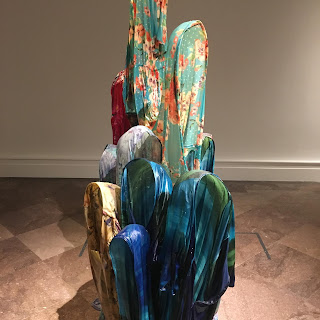
#1 This was just added to the collection recently and I think it is amazing how they stand up own their own with no support. The Artist said that these was the type of dresses his mothers and aunts worn.
Art and Criticism 
1. When I seen this structure that made me curious to how are these dresses was standing up with out support .The artist used different textures of clothes and resign to  give the dresses a form .It was different colors and shapes that was used for the illusion. it reminds me of a family picture how the dresses was positioned, also reminded me of night gowns I use to wear as a child. 
Artist: Kevin Beasley Untitled (hollow) ,2016 size was not displayed Resin housedresses, and Kaftans 


#2 I liked that they was able to look at the word liquor and form a new word and to  me soul is a very deep work ex specially when you mix it with liquor. Alcohol had destroyed people and families for years and I didn't notice until I took a closer look that it had so many different types of shoes and laces and that was a very deep statement. 
Art and Criticsm 
1. This sculptures spoke to me as a representation of liquor, environment and souls can be lost through alcoholism. This artist used Lines, shapes, different colors, value when the only letters lit up on the sign is soul and its upside down. This reminds me of every sign I see while driving in my community . I like this picture it speaks volumes about society. The artist was trying to show us how they came together loisidas gather to celebrate rite passages and mourn loved ones that was lost .
Artist:  Nardi war Loiaidas LiquorsouL,2011 Meatal, Plexigals, fluorescent sign, PVC pipe, artificial flowers, shoes laces and shoe tips size of sculptures wasn't enclosed.


#3 


#3 The main attraction is this sculpture with different types of metal pans and cooking utensils. This photo symbolized the person challenge to overcome new and unfamiliar obstacles for their family and to adapt to natural resources to survive and learn. 
Art and Criticism 
1.I see a collection of different pots and pans and water flowing through some of them. The artist used form to build the structure. Space wasn't a concern this structure is very large and hard to capture in one photo . This reminds me of the pots my moms use on holidays, reminds me of food. I think it was a symbolism of the different things that contribute to life and daily struggles. The artist was trying to tell his story from his point of view of his family and upbringing.
Artist : Subodh Gupta
This is not a fountain ,2011-13 Old aluminum utensils, water, painted brass taps, PVC pipes and motor. The size wasn't included.

Sunday, November 4, 2018

My mask sketches

Final sketch 

My first sketch
1. I uploaded three images to my blog https://www.blogger.com/blogger.g?tab=mj&blogID=1385035894977000337#allposts and analized and described the sketches using elements of art and principles of art.
2.included art criticism
3. I uploaded my mask sketch
4. I used the elements of line, shapes, space, pattern and value when making my mask. I like the more realistic mask and art work and found it very hard to make a realistic looking mask. I used pattern when making my mouth mask and unity with the bringing nose and mask eye mask together. I felt like I emphasized on the eye aspect in my mask.
5.I found it difficult to make a mask so many thoughts was in my head. I wanted it to look a certain way but wasn't physically possible to make it so it made me a little frustrated. I do like my mask I may cut it out and laminate it to keep and hang up on my wall.
5.

mask

#1                                                                    

Coffin mask of queen consort of king Djehuti (around 1650 BC). Staatliches Museum Ägyptischer Kunst (State Museum of Egyptian Art) in Munich.

I picked this piece of Queen Conseort of King Diehuti cause I liked the fact that you couldn't see unless reading that this is actually a woman. I liked the materials they used to sculpt this, it say that they were made of gold, jade and turquoise. I licked how the mask looks very realistic. I like the shine the light is giving the picture as it reflects off the face it looks like some form of plaster. The way they formed the hat to fit on the head look like it was a very heavy hat. I like how your able to se all the shapes, lines and details on the face and ears. The hat looks like it was evenly balanced on the mask.  


#2                                                                                                                                           


I picked this death mask cause it looked very interesting, that people actually made mask out of a person's face following their death. They became recognizable when King Tut had one done following his death. This mask looks very realistic despite the black and white contrast and the feeling of emphasis on the details to the face. No color was used that's why I believe the picture looks so unique. The line and pattern on the eye lashes is great. it is like you could see the lashes moving in the wind.


#3


This military face mask (thought to have been worn in battle and during parades by cavalry) is one of the most exceptional finds at the site of the Battle of the Teutoburg Forest. It is one the oldest facial helmets known in the Roman army, dating from the first part of the 1st century CE. Museum und Park Kalkriese, Germany. Photographer: Carole 

I picked this picture because when I think of a mask this is the most common mask that comes to mind. It isn't rich in color but it actually looks like you could put this on and wear it. They cut holes out of the eyes, nose and mouth. The materials looks very hard and sturdy. It looks like it is very durable and with stand a few hits. The pattern used was a very natural realistic pattern when gives for a still look. space was used for the exact marking to allow for then to see, smell and talk.

Sunday, October 7, 2018

                                                   Module #6 Peer review

#1 https://allydemski.blogspot.com/2018/09/a.html?showComment=1538950725991#c8616446354413658969
http://s558.photobucket.com/user/allydemski/library/AED%20200%20Project%201

 #2 I was not able to see the Images from her first Blog

#3 I enjoyed the Images she captured at the Museum .The images was not the same as mine. She also had a personal connection to ma few of hers. When I was looked at the pictures I was looking for color, shapes, form, movement . She made me look at the picture from a different perspective and how your environment can sometimes impact your work and you don't realize it.

#4 The Image that piqued my attention was the 1997 Chromogenic Color print by Marion Faller tilted Carving #4 beechtree, Southpark, Buffalo, ny November 1997. I liked how he captured a Tree but he also captured the details in the carving .We was able to see the tree from the perspective of someone that has seen the Tree daily and began to carve at the wood. It raised the question to me , how many people have carved that tree ?

#5 The peer reflection is very valuable it makes me understand Art from different perspectives and it gives me a chance to see things different and to think not just come up with my own views.

#6 I have read reviews by peers . I know that now I'm going to put a lil more effort into my visual presentation while I Blog . I am a visual learner so it's teaching me a better


#1 https://hectorcocoaed200blog.blogspot.com/2018/09/art-gallery-visit-module-5.html?showComment=1538952311555#c3841568273286624200
s346.photobucket.com/user/HCoco89/slideshow/Module+3?src=pb_unauth

#2 I was not able to see his photos from photo bucket as well.

#3 Yes Hector did have a few of the same photos as me . He had the Grass 1965 Artist Len Lye. The Victor Vasarley Vega-Nor,1969 Oil on Canvas and The loud tactile painting 1962 by Yaacov Agam made of wood and metal. I took my daughters and they was able to touch the Art .

#4 The same images they he picked are a few of the same images I picked. I enjoyed that these pieces of Art was more than Two -dimensional . I liked the connection he mad with The street music 1950 by Normal Wilfed and the personal connection that he had to it maked me think of the different type of music I listen to when I'm happy, sad and emotional.

#5 Yes the peer review is valuable it lets you build on different perspectives


Monday, October 1, 2018

COLOR

Color is a way we see the hues and it's reflection to light. to have questions,to think outsid ethe box was new and inviting. The effect color has on emotions is huge. Colors let you express how you feel by using different hugs,symbols,shapes . Artist use the color red to emphisise on emotions to express anger,violence.confusion. You use these colors to express strong emotions.Colors are suppose to "move the Artist June Redfern.Asthethics is a great example scientifc example in how art and emotions coincide.I think it's fascinating to be able to identify the origin in where creativity and religious beliefs manifested and grew to be called  Art.I also like the how civilization and having a voice transpired in the Renaissance Area. Having a voice and being able to express in it in ways to communicate all over the world. To spark a debate ,To have questions to think outside the box had to be learned. You was free to be creative without religious ties.I liked Davids theory"Feelings are yearing to be better to be true to inner nobility" To me it meant we as Human search to find ourselves the purpose of this all and sometimes we get so deepth within the search that we miss out on things or we continue to searching and grow and find our calling and our passion.It makes you want to find more. The burning sensation for knowldge.On the color video my biggest impact was to look at things from a different perspective. I felt the Area in Vience wher June was painting weas breath taking i neve seen anything like that in person . I found it difficult that the Fresco painters didn't htink the environment was a creative place to pain tdue to the lighing from the water and the reflection of the buildings. I liked how the buikldings look like they was coming out of the water. . In the Feelings"Emotion and Art i emjoyed how Art has matured through the years from only painting for religious reason and the spiriual path from accepting different images that may not be accepted and understood by the world we live in . I find it ironic how Civilization can influence charge and art can't influence civilization and David showed that it could.People was able to express the art of feeling and took painting to a whole another level you was able to see things as they was happening. You able to visual the words in books due to the details of the pictures and the emotions that was behind the techique.  r has on emotions is huge. Colors let you express how you feel by using different hugs,symbols,shapes . Artist use the color red to emphisise on emotions to express anger,violence.confusion. You use these colors to express strong emotions.Colors are suppose to "move the Artist June Redfern.Asthethics is a great example scientifc example in how art and emotions coincide.I think it's fascinating to be able to identify the origin in where creativity and religious beliefs manifested and grew to be called  Art.I also like the how civilization and having a voice transpired in the Renaissance Area. Having a voice and being able to express in it in ways to communicate all over the world. To spark a debate ,To have questions to think outside the box had to be learned. You was free to be creative without religious ties.I liked Davids theory"Feelings are yearing to be better to be true to inner nobility" To me it meant we as Human search to find ourselves the purpose of this all and sometimes we get so deepth within the search that we miss out on things or we continue to searching and grow and find our calling and our passion.It makes you want to find more. The burning sensation for knowldge.On the color video my biggest impact was to look at things from a different perspective. I felt the Area in Vience wher June was painting weas breath taking i neve seen anything like that in person . I found it difficult that the Fresco painters didn't htink the environment was a creative place to pain tdue to the lighing from the water and the reflection of the buildings. I liked how the buikldings look like they was coming out of the water. . In the Feelings"Emotion and Art i emjoyed how Art has matured through the years from only painting for religious reason and the spiriual path from accepting different images that may not be accepted and understood by the world we live in . I find it ironic how Civilization can influence charge and art can't influence civilization and David showed that it could.People was able to express the art of feeling and took painting to a whole another level you was able to see things as they was happening. You able to visual the words in books due to the details of the pictures and the emotions that was behind the techique.                                                                                                                                                                                                                                                                                                                                                                                                                                                                                                                                                                                                                                                                                                                                                                                                                                                                                                                                                                                                                                                                                                                                                                                                                                                                                                                                                                                                


Sunday, September 30, 2018

Logo

http://s1149.photobucket.com/user/DANIELJA03/media/IMG_0367_zpshcckavck.jpg.html?sort=3&o=0   (draft)


http://s1149.photobucket.com/user/DANIELJA03/media/IMG_0366_zpsgyt7ly0t.jpg.html?sort=3&o=1  (draft)


http://s1149.photobucket.com/user/DANIELJA03/media/IMG_0305_zpsotanamob.jpg.html?sort=3 &o=14   (final logo)


These was sketches  and a logo I designed for My fundaments of Art Class.

ART Albright-Knox Art Gallery 2018


A